
Here you’ll find a selection of my graphic design and UI/UX projects, including branding, interface design, and other design explorations. This collection brings together personal experiments and professional work, reflecting different stages of my journey in design and visual communication.
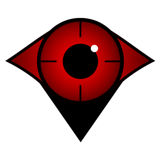
The Red Waypoint
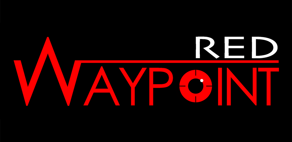
Red Waypoint is a versatile mission planning app for DJI drones, designed to make autonomous flights intuitive and precise. Beyond its technical capabilities, the app’s visual design plays an important role in usability and brand identity.
The signature red color is drawn from the app’s brand identity, creating a strong visual presence while also serving a functional purpose: it clearly marks waypoints and flight paths on the map, making them easy to see at a glance during mission planning. This combination of color, typography, and interface layout ensures clarity, focus, and accessibility for users navigating complex flight routes.
Key Features
- Offline Flight Planning – Plan missions anywhere, without needing an internet connection.
- Real-Time Mission Editing – Adjust waypoints and flight paths on the fly.
- Comprehensive Flight Path Tools – Draw lines, circles, rectangles, and grids for precise drone navigation.
- FPV Integration – Stream live video from your drone to guide your mission.
- Automated Image Capture – Schedule photos at specific intervals or locations.
- Flight Simulation – Preview missions before flying to ensure accuracy.
Design Highlights
- Red Waypoints & Paths – High visibility on maps, reflecting the brand while aiding usability.
- Clean, Intuitive Interface – Designed to reduce cognitive load and make mission planning faster and more accurate.
- Visual Hierarchy – Icons, colors, and typography guide the user naturally through complex flight setups.
By combining functionality with thoughtful design, Red Waypoint helps drone pilots plan, execute, and monitor missions efficiently while staying visually oriented and brand-consistent.
no images were found
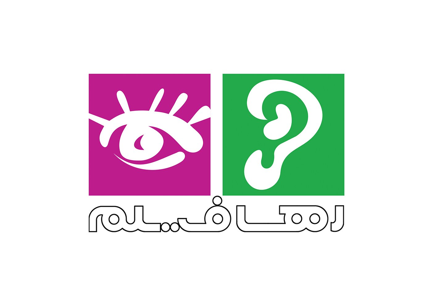
Raha Film – Institute of Art and Culture
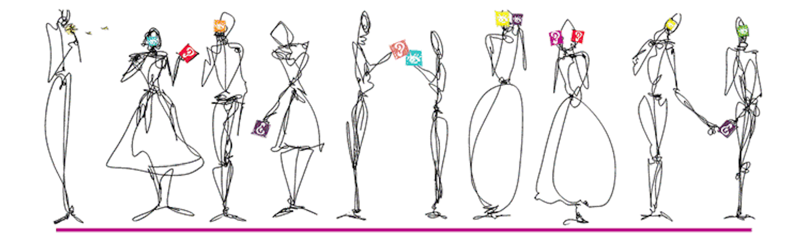
For Raha Film, I designed the logo and visual identity, as well as covers for DVDs, posters, and other promotional materials. In addition, I created the website design and accompanying illustrations, ensuring a consistent and engaging visual experience across both print and digital platforms.
The project focused on building a cohesive visual language that reflects the institute’s dedication to art, culture, and cinema. Each element—logo, printed materials, web interface, and illustrations—was designed to communicate professionalism, creativity, and cultural depth, while maintaining a recognizable and unified identity.
no images were found

Kayson inc.
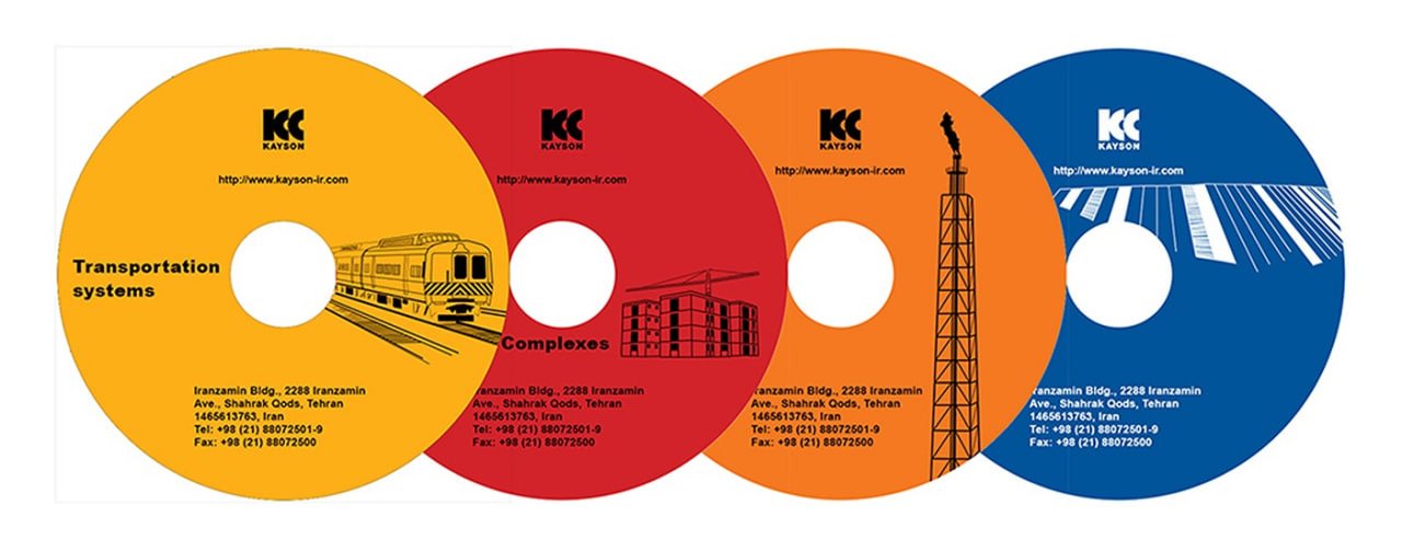
Kayson Inc. – Brochure Design (2017)
In 2017, I designed a corporate brochure for Kayson Inc., highlighting the company’s four main divisions: Mass Housing, Oil and Gas, Water and Wastewater, and Transportation. The layout and visual design were crafted to clearly present each division’s projects while maintaining a cohesive and professional look. Through typography, imagery, and structured organization, the brochure communicates Kayson Inc.’s expertise and scope across multiple sectors.
